11 Proven Tips to Create High Converting eCommerce Landing Pages in 2026
You can have the best ad campaign in the world, razor-sharp targeting, eye-catching creatives, and a steady stream of clicks. But here’s the truth: clicks don’t pay the bills, conversions do.
The problem? Too many businesses in 2026 are still sending valuable traffic to cluttered homepages or generic product pages.
That’s like inviting customers into your store and then leaving them to wander around aimlessly. Without direction, most of them leave.
This is where dedicated eCommerce landing pages come in.
A landing page is a focused, standalone page designed with one job: turning visitors into buyers. And when optimized correctly, it can transform the return on your ad spend.

Just look at the numbers:
- The average landing page converts at 2.35%, but top performers push well above 10%+.
- A Deloitte study found that cutting load time by just 0.1 seconds can increase conversions by 8%, a game-changer in mobile shopping.
- With over 60% of online sales now happening on mobile devices, speed, clarity, and simplicity aren’t optional; they’re survival.
Think of your landing page as your digital salesperson.
It welcomes every visitor, explains the value of your product, removes doubts, and directs them to the “Buy” button.
Done well, it doesn’t just support your ads; it multiplies their impact.
Key Takeaways
Here’s what this guide will show you step by step:
- One Page, One Goal – Why high-converting landing pages strip out distractions like menus, links, and clutter, focusing only on the action that drives sales.
- Headlines That Sell – How to write headlines that highlight customer benefits, spark curiosity, and convince people to keep reading.
- Visuals That Persuade – Why crisp product imagery, lifestyle shots, and short demo videos can dramatically increase engagement and trust.
- Trust at First Sight – How to use reviews, testimonials, ratings, and “As Seen On” logos to build instant credibility and reduce hesitation.
- Speed & Mobile First – The non-negotiables of fast loading, thumb-friendly design, and mobile-first layouts in today’s eCommerce landscape.
- Urgency & Scarcity (Done Right) – How to use countdown timers, stock counters, and limited-time offers ethically to drive faster decisions.
- The Power of Testing – Why continuous A/B testing of headlines, CTAs, layouts, and offers is the fastest path to higher conversions.
By the end of this article, you’ll have a proven playbook to turn traffic into customers and ad spend into revenue.
Why Landing Pages Matter for eCommerce Conversions
Think about the difference between a homepage and a landing page.
A homepage is like the lobby of a shopping mall. It has signs pointing in all directions, products, categories, blog posts, and company info.
That’s great for browsing, but if someone walked in ready to buy, they’d waste time figuring out where to go.
A landing page, on the other hand, is like a private showroom built for one product.
There’s no clutter, no distractions, just a clear path to the checkout. Every element on the page has a single job: to move the visitor closer to buying.
This laser focus is why landing pages consistently outperform standard product pages in ad campaigns.
When people click an ad, they already have intent. They don’t want to scroll through menus or compare five products.
They want to know:
- Does this product solve my problem?
- Can I trust this brand?
- How do I buy it right now?
Landing pages answer those questions instantly.
The data backs this up:
- The average eCommerce website conversion rate hovers around 2-3%. But focused landing pages can see conversion rates above 10%.
- Research shows that removing navigation menus from landing pages can increase conversions by up to 100% because it eliminates exit points (HubSpot).
- With paid ads costing more each year, sending clicks to a generic page is essentially throwing money away.
In 2026, when over 60% of online purchases happen on mobile, the need for clarity is even greater.
A mobile user who has to pinch and zoom their way through a cluttered homepage is gone in seconds.
A mobile-optimized landing page, however, delivers exactly what they came for, fast.
Simply put:
- Homepages are for exploration.
- Landing pages are for conversions.
If you’re spending money to drive traffic, every click deserves the VIP treatment of a landing page.
Done right, it’s the difference between traffic that leaks away and traffic that turns into profit.
11 Proven Tips to Create High Converting eCommerce Landing Pages
1. Keep Your Message Clear and Focused
Visitors should instantly know what your page is about. Avoid stuffing your landing page with multiple offers or distracting links.
A strong headline and supporting subhead keep attention where it belongs.
For example, Slack’s landing pages highlight one simple promise, “Make work life simpler, more pleasant, and more productive”, instead of listing every feature upfront.
2. Craft Headlines That Hook Attention
Your headline is often the only thing a visitor reads before deciding whether to stay or leave.
A great headline combines clarity with curiosity.
Think “Save 20% on Your First Order, Limited Time Only” instead of something vague like “Welcome to Our Store”.
Data shows that 8 out of 10 people read headlines, but only 2 read the rest, so getting this right is critical.
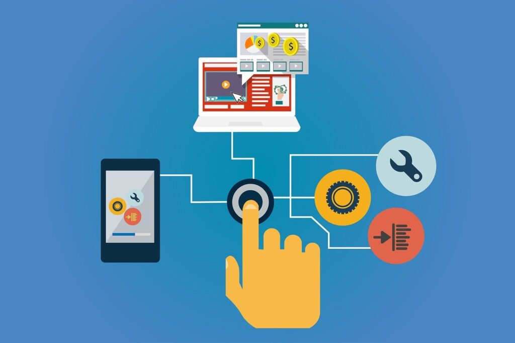
3. Use High-Quality Visuals That Sell
Images and videos are your best salespeople online.
Show products in action, highlight benefits, and use lifestyle photos that help customers imagine themselves using your product.
For instance, Dollar Shave Club’s landing pages use fun, relatable videos that both entertain and sell, driving millions of subscribers.
4. Write Copy That Speaks to Benefits, Not Features
Features tell, but benefits sell. Instead of saying, “This coffee machine has a 12-cup capacity,” say, “Brew enough coffee to fuel your entire team all morning”.
Brands like Apple excel at this. Notice how they focus on the experience (“Shoot stunning photos in any light”) instead of tech jargon.
5. Build Trust With Social Proof
Customer reviews, testimonials, and trust badges make or break conversions.
In fact, 88% of consumers trust online reviews as much as personal recommendations.
Add video testimonials, user-generated photos, or recognizable media logos where you’ve been featured.
A great example is Glossier, which showcases customer photos alongside reviews to build instant credibility.
6. Eliminate Distractions and Exit Points
Every link that doesn’t push a user toward conversion is a potential leak.
Landing pages should remove navigation menus and unnecessary footers.
Research by HubSpot shows that removing navigation links can increase conversions by up to 100%.
Think of your landing page as a tunnel; once someone enters, the only way out should be the “Buy” or “Sign Up” button.
7. Use Strong, Action-Oriented CTAs
A call-to-action (CTA) is where the magic happens.
Instead of bland CTAs like “Submit,” use action-driven text such as “Get My Free Trial” or “Shop the Collection Now”.
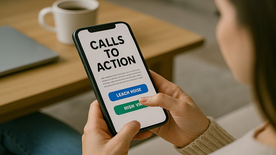
Color contrast also matters; Shopify reports that contrasting button colors can boost clicks by up to 21%. Make your CTA impossible to miss.
8. Optimize for Mobile First
With 60%+ of online purchases now happening on mobile, a desktop-only design is a conversion killer.
Ensure your landing page loads fast, buttons are thumb-friendly, and text is easy to read without zooming.
Brands like Warby Parker excel here; their landing pages are mobile-first, ensuring customers can try their home trial kit on the go.
9. Highlight Scarcity and Urgency
People act faster when they feel they might miss out.
Adding countdown timers, limited stock notices, or “Offer Ends Today” messaging can dramatically increase conversions.
For example, Booking.com uses urgency masterfully, showing how many people are viewing a listing and how few rooms are left, triggering immediate action.
10. Test and Refine With A/B Experiments
The highest-performing landing pages aren’t born perfect; they’re tested into perfection.
Change one variable at a time (like headline, CTA color, or testimonial placement) and track conversions.
Companies like Unbounce have shown that continuous testing can lead to double-digit conversion lifts over time.
11. Prioritize Speed and Performance
If your page takes more than 3 seconds to load, over half of the visitors will leave.
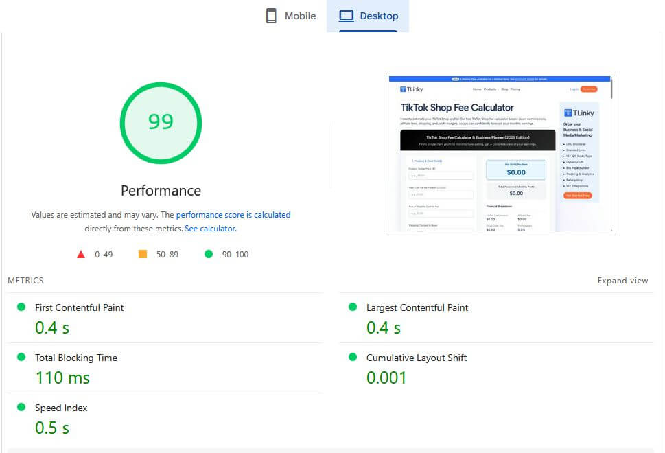
That’s lost revenue before they even see your offer.
Use tools like Google PageSpeed Insights to compress images, remove unnecessary scripts, and enable caching.
Amazon once reported that a one-second delay in page load could cost $1.6 billion in sales annually, proof that speed equals money.
Bringing It All Together:
A high-converting landing page isn’t about one trick; it’s the combination of clarity, trust, design, and psychology.
Each tip builds on the next, guiding visitors smoothly from curiosity to action.
Hostinger helps boost your website speed, ensuring a smoother and faster user experience.
Common Landing Page Mistakes to Avoid
Even the best marketers make missteps when building landing pages. Avoid these common pitfalls that quietly kill conversions:
Too Many Calls-to-Action (CTAs)
If your page has three different buttons, “Buy Now,” “Sign Up,” and “Learn More”, visitors won’t know what to do.
This confusion leads to hesitation, and hesitation kills sales. Instead, stick to one primary action and reinforce it throughout the page.
Cluttered Design and Walls of Text
Landing pages aren’t blog posts. Long paragraphs, busy backgrounds, or too many competing elements overwhelm users.
For example, a product launch page with multiple sliders, auto-play videos, and flashy pop-ups feels chaotic. Keep it clean, with short, scannable sections that guide the eye.
Ignoring Mobile Optimization
Over 60% of purchases happen on mobile, yet many businesses still design for desktop first.
A page that looks beautiful on a laptop but requires pinching and zooming on a phone is a guaranteed conversion killer.
Always test your page on mobile devices before going live.
Weak or Generic Headlines
“Welcome to Our Store” doesn’t inspire action.
Headlines that fail to communicate a clear benefit leave visitors uninterested. Instead, lead with value: “Get Fit at Home, Shop Our Premium Workout Gear”.
No Trust Builders
If your page has no reviews, testimonials, or recognizable trust signals (like payment security icons), visitors may click away. People buy from brands they trust; neglecting this element is like asking strangers for money without offering proof.
Slow Page Load Speed
Even the most persuasive copy won’t save you if your page loads in 7 seconds.
Research shows 53% of users abandon pages that take longer than 3 seconds.
Compress images, clean up scripts, and prioritize speed.
More useful article for you:
👉Which eCommerce Platform Is Best for SEO in 2026? Full Comparison Guide
👉How to Build Backlinks for eCommerce: Complete Guide
👉eCommerce SEO Content Optimization: Proven Strategies to Boost Search Rankings in 2026
👉10 Tips to Choose a eCommerce Website Builder for Your Business
Frequently Asked Questions (FAQ)
Do I really need a landing page if I already have a website?
Yes. Your homepage is like a storefront window, while a landing page is a direct sales pitch for one product or offer. Sending ad traffic to a homepage wastes money; a landing page removes distractions and increases conversions.
How many landing pages should I create?
As many as you need to match your campaigns. Businesses with 10-15+ landing pages see 55% more leads compared to those with fewer than 10 (HubSpot). Each page should focus on one audience, product, or campaign.
Should my landing page be long or short?
It depends on your offer. A simple discount might only need a short page with a strong CTA. A high-ticket item, like software or coaching, benefits from longer pages with testimonials, features, and FAQs. Rule of thumb: longer pages work best when customers need more trust before buying.
What’s the best way to improve my landing page?
Test, don’t guess. Run A/B tests on headlines, CTAs, layouts, and images to see what resonates with your audience. Even small tweaks, like changing “Buy Now” to “Get My Discount”, can have a measurable impact.
How much should I spend building one?
It doesn’t have to be expensive. You can use tools like Unbounce, Leadpages, or Instapage to build and test pages without coding. What matters most isn’t budget, it’s clarity, relevance, and customer focus.
Final Thoughts: Building Landing Pages That Sell
Landing pages aren’t just marketing add-ons; they’re profit engines for eCommerce in 2026.
Unlike generic product or homepage experiences, they’re laser-focused on one offer, one audience, and one action.
That’s why businesses that invest in landing pages consistently see higher conversion rates and a better return on ad spend.
The secret to success isn’t guessing, it’s testing.
Headlines, CTAs, visuals, and layouts all impact results, and the brands that continuously optimize are the ones that win.
Remember this: every click costs money. Sending traffic to a cluttered homepage is like pouring water into a leaky bucket.
But sending it to a well-structured landing page is like aiming every drop straight into the glass.
If you put clarity, trust, and customer experience first, your landing pages won’t just convert today; they’ll continue to build loyalty, sales, and growth for years to come.